Designing No-Code Policy Management for Citizen Developers
Reducing complexity and enabling cross-functional collaboration through intuitive UX, visual design, and user-led validation

The problem
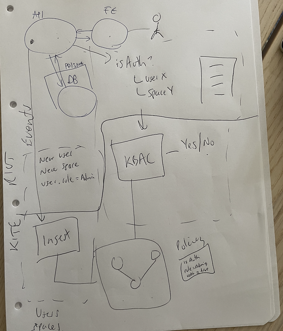
IndyKite’s services are powerful but complex, designed for expert developers. As the industry shifts toward citizen developers, we needed to bridge the gap between technical users and business stakeholders who want to engage with the platform.
Working closely with a Product Manager, we identified the core needs for an MVP of the authorization service. Through user testing, interviews, and ethnographic research, we validated our early hypotheses and refined the direction for policy management.
The solution
We designed a no-code policy builder with an interactive UI that lets users create and configure rules without writing code. By using visual graphs to represent policies, we helped users understand complex logic at a glance.
This approach lowered the learning curve and opened the service to a wider audience, including non-technical users involved in policy creation and management.
Research
To inform the design of a more inclusive policy-building experience, we set three primary research goals:
How to leverage no-code solutions to support less technical users?
How to help users manage complex authorization logic more effectively?
How to ensure a no-code approach can be as powerful as code-based solutions?

Ethnographic research
Observing developers build policies revealed heavy reliance on pen-and-paper workflows and external references, signs of complexity and poor discoverability.
User testing and interviews
Iterative sessions with sales engineers and target users highlighted key challenges, such as difficulty writing conditions and onboarding delays due to learning Cypher.

SWOT and competitor analysis
Helped benchmark functionality and identify gaps in usability across the market.
Key insights
These findings shaped the foundation for a no-code, visual-first policy builder, a tool designed to reduce friction, improve clarity, and expand access to policy creation across a broader range of users.
Users found writing policy conditions the hardest part.
Many lacked confidence in navigating Cypher or technical syntax.
A strong need emerged for visual tools and guided input to reduce the learning curve.
Defining the problem
Users responsible for building authorization policies were blocked by the need to learn Cypher, a complex query language. This created friction, delayed onboarding, and excluded non-technical contributors from participating in policy creation.
We needed to design a no-code solution that simplified this process, while still supporting complex logic and relationships. Our goal was to lower the learning curve and make policy creation more inclusive and intuitive.

User Persona
I created personas based on research findings to keep our focus on user pain points and motivations.
The persona helped align stakeholders and guided our design decisions throughout the project.

Ideation & Exploration
Collaborated with PM to define product requirements.
Conducted a mood board audit of other rule builders and no-code tools.
Explored design conventions for visual logic and policy creation.
Wireframing & Feedback
To validate our approach early, I facilitated a low-fidelity wireframe workshop with the broader product team.
Key Outcomes:
-
Exposed technical feasibility issues early
-
Strengthened team buy-in for a no-code direction
-
Revealed gaps in our shared understanding of policies
-
Increased overall project transparency
Ideation
With research insights in hand, I collaborated with the Product Manager to define initial task flows and product requirements. We focused on simplifying complex logic into manageable steps while maintaining flexibility for advanced use cases.
To explore potential UI patterns, I conducted a mood board analysis of rule builders and no-code platforms—drawing on familiar interaction models to reduce cognitive friction for new users.
Task Flows
I mapped out detailed task flows to understand how users would navigate from exploring existing policies to building new ones. These diagrams helped us:
-
Visualize system entry points and touchpoints
-
Plan for draft creation and iterative building
-
Identify where users might need extra support or guidance

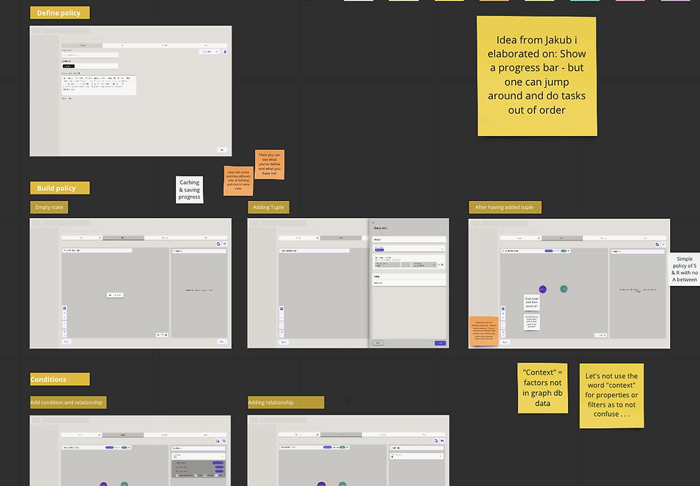
Low-Fidelity Wireframes
Using the task flows, I created a set of low-fidelity wireframes to shape the experience. Key design steps included:
-
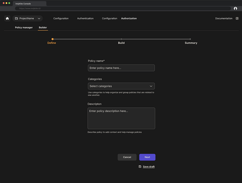
Step 1: Policy Overview
Users can name their policy, assign categories, and add a description—laying the foundation for easy organisation and future edits.
-
Step 2: Statement & Conditions
This screen allows users to define the policy logic using a no-code interface with clearly grouped inputs. A visual graph helps illustrate how rules and data points connect.
-
Step 3: Policy Summary
Before finalizing, users are presented with a summary view to validate their logic and avoid errors—improving clarity and confidence.

Feedback & Iteration
I facilitated a wireframe review workshop with the agile team to collect cross-functional feedback early in the process. These sessions surfaced:
-
Technical feasibility concerns
-
Opportunities to clarify logic flows
-
Increased internal alignment and project transparency
-
Gaps in my own understanding of policy logic, which I later addressed in subsequent iterations
This feedback loop was instrumental in shaping a more usable, realistic MVP design.

User Test
I ran moderated usability tests with 5 participants, including sales engineers and developers, to evaluate early wireframes.

Goal One
Will user understand policy definition?
Goal Two
How will users experience creating a policy triple (Subject, Action, Resource)?
Goal Three
Can users easily add conditions?
Goal Four
How will users experience the saving flow?
Key Feedback
User feedback revealed a strong need for clarity, control, and confidence during policy creation.
Comments like “I wasn’t sure if my policy was complete” and “I’m missing the relationship I added” highlighted gaps in visibility and validation.
This directly influenced my decision to include a policy summary step, use progressive disclosure to reduce overwhelm, and ensure real-time visual feedback in the graph view. These insights helped me prioritize features that reduce cognitive load and reinforce user trust in the tool.
Sales Engineer
“This helps me a lot. Defining Subject, Action, Resource in a broken-down way makes sense.”
ML Engineer
“This is very useful compared to writing in Cypher.”
BE Engineer
“I’m missing the relationship I added, users expect relationships to be reflected in the graph.”
Product Manager
“I wasn’t sure if my policy was complete, I’d like a clear indicator when everything is set up correctly.”
Data Synthesis
After testing, I processed feedback into a matrix of issues, insights, and actionable design changes.
Interpreting Feedback
After low-fidelity testing with five participants, I synthesized usability issues into actionable insights. This process helped surface friction points in the policy builder experience—particularly around discoverability, flow, and cognitive overload.
The table captures recurring user challenges, such as:
-
Confusion between low-code and no-code modes
-
Difficulty understanding policy structure (e.g., tuples, condition placement)
-
Unclear visual hierarchy and overwhelming graph interactions
-
Lack of clear entry points and save feedback

How Testing Influenced Design
The synthesis of usability feedback directly shaped the next iteration of the policy builder. To reduce confusion between low-code and no-code modes, I prioritised making the toggle more visible and clearly labeled.
Users’ struggles with understanding tuple logic and condition placement led me to decouple the policy graph from traditional form inputs, using panels and progressive disclosure to simplify the experience. Interactions within the graph itself were refined by improving node snapping, introducing responsive hover states with contextual “+” icons, and replacing ambiguous colour codes with recognisable icons. These changes were designed to reduce friction, clarify structure, and support a more intuitive no-code authoring experience.

Identifying High Priority Design Improvements

Improvement One
Users expressed that they liked the use of graph technology to help them understand their policies.
But... using forms in combination with the graph was overwhelming. As a result I iterated on the page hierarchy, and used a panel solution to chunk the form into digestible sections that will only be triggered once the user interacts with the graph.
Improvement Two
Users wanted a ‘walk-me’ flow through the building process. This posed a challenge for space in the UI.
Instead of using a wizard approach, I experimented with using progressive disclosure.
Improvement Three
Users wanted to be able to drag and drop relationships.
Design Iteration
With insights from user testing and technical feedback, I moved into high-fidelity iterations, focusing on building a usable, scalable interface that balanced power with simplicity.

Navigation & Entry Points
I redesigned the policy start screen to let users choose between no-code and code modes up front. This helped reduce uncertainty, especially for less technical users.
I also introduced draft-saving functionality from the very first step, enabling users to pause and resume complex policy builds.
Graph Interactions & Chunking
To reduce cognitive overload, I implemented a panel-based UI. When users interact with a node in the graph, the corresponding configuration panel appears, isolating that logic in a digestible format.
This chunking approach emerged directly from testing, where users reported confusion with dense forms and overlapping logic inputs.

Node-Level Editing
We added the ability to open nodes and apply filters, enabling precise control of policy conditions without relying on syntax.
This addressed a major pain point raised during usability testing, where users struggled to define relationships clearly without writing Cypher queries.

Finalising & Switching Views
At the final stage of policy creation, users can review their logic, view the generated JSON/Cypher, and toggle between visual and code views.
This validation step not only builds user confidence but also supports hybrid users who may want to inspect or copy the raw code.

Managing Policies
Lastly, the Policy Manager dashboard allows users to find, activate, and manage their newly created policies.
Each entry includes metadata, version history, and category tags to support long-term maintenance and collaboration.

Lessons Learnt
Working on this project gave me a deep and hands-on experience in tackling a complex, technical challenge, designing a no-code interface that could empower users with limited engineering experience to confidently build access policies.
Lesson One
One of the most valuable lessons came from collaborating with stakeholders across technical and non-technical roles. I learned how to balance business needs with user expectations, often acting as a bridge between product, sales engineers, and developers.
Through this, I became more confident in navigating difficult conversations, finding alignment, and advocating for solutions that supported both usability and scalability.
Lesson Two
Another major area of growth was the refinement of my prototyping and testing process. Creating high-fidelity prototypes that felt real enough for users to engage with allowed me to uncover unexpected usability issues early.
These prototypes helped me validate key interactions, especially in areas like graph navigation, rule configuration, and progressive disclosure-ultimately shaping a more accessible and intuitive product.
Lesson Three
This project also pushed me to think holistically about how interface design supports confidence, clarity, and comprehension, particularly in deeply technical domains.
I leave this experience with a stronger ability to turn abstract complexity into human-centered design, and a toolkit of collaborative, iterative methods that I’ll carry forward into future challenges.